INVESTOPEDIA.
THE TRUMP ECONOMY.
Project Introduction
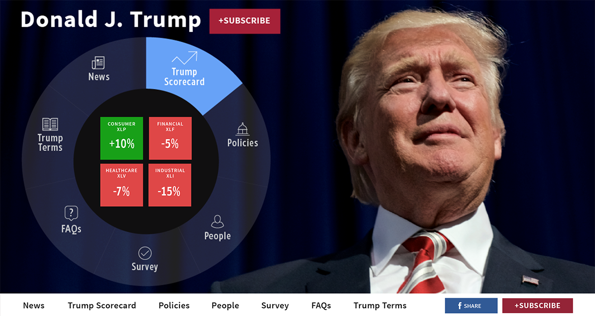
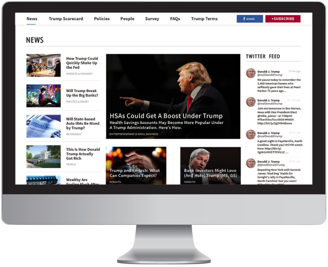
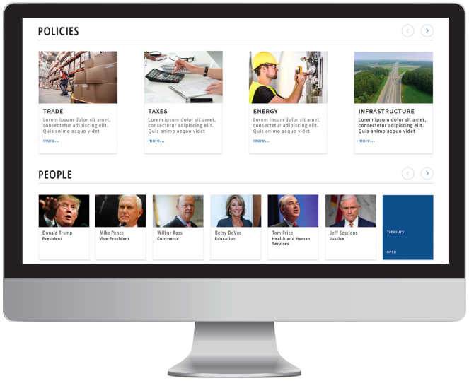
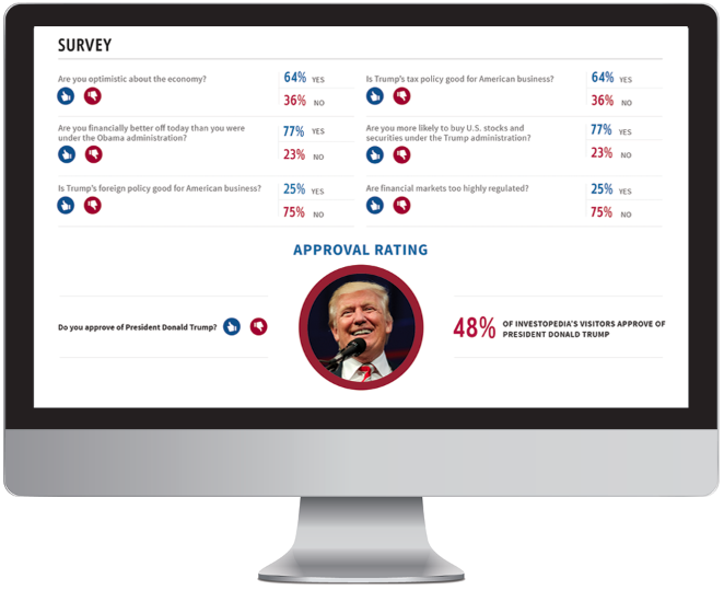
Donald J. Trump is a topic page for Investopedia that shows the news related to Donald Trump, a scorecard, his proposed policies, key people in his administration, a survey gauging his approval, FAQs, and “Trump Terms”— which are essentially definitions, for example, Trumponomics.
The victory of Trump in November 2017 presented the opportunity for the editorial team of Investopedia to create a dynamic page that addressed issues from the presidential election. Essentially, the page acted as a tracker of Trump and his new administration.
Project Team and Roles
The project team was comprised of the Director of Product Management, UX, Editorial, Development, and SEO. The interdisciplinary nature of the team helped with the collaborative effort in brainstorming ideas to create a unique page not only for Investopedia, but also for category pages of news content websites.
Responsibilities
1. Project kickoff with the Editorial team and Director of Product Management
2. Brainstorm content ideas with the Editorial team and Director of Product Management
3. Research Editor-in-Chief's idea for a radial UI
4. Create quick sketches to show radial UI
5. Create wireframes
6. Design infographic visual for the Investopedia Anxiety Index
7. Collect editorial images for visual design
8. Utilize visual design system established from prior pages to create a branded page
Project Goals
Create a unique page for Investopedia that would engage its over 20 MM visitors.
Promote the Investopedia brand by utilizing visual design style developed in prior projects like home page redesign, markets redesign, and tax center pages.
Initial Versions
The radial UI proved to be the most challenging aspect of the design of the page. References were collected along with sketching and quick mockups of how the experience would work. It was an innovative UI for the Investopedia brand. However, it was the direction that the Editor-in-Chief wanted to go in to make the page stand out from other news content sites. The product team was initially unsuccessful with its attempts. However, the problem was continually researched until a solution was achieved which had to be redone because of the interaction and the hero image combination. The team had to completely rethink its approach while keeping some UI elements that accomplished what the internal stakeholders were seeking with the page.
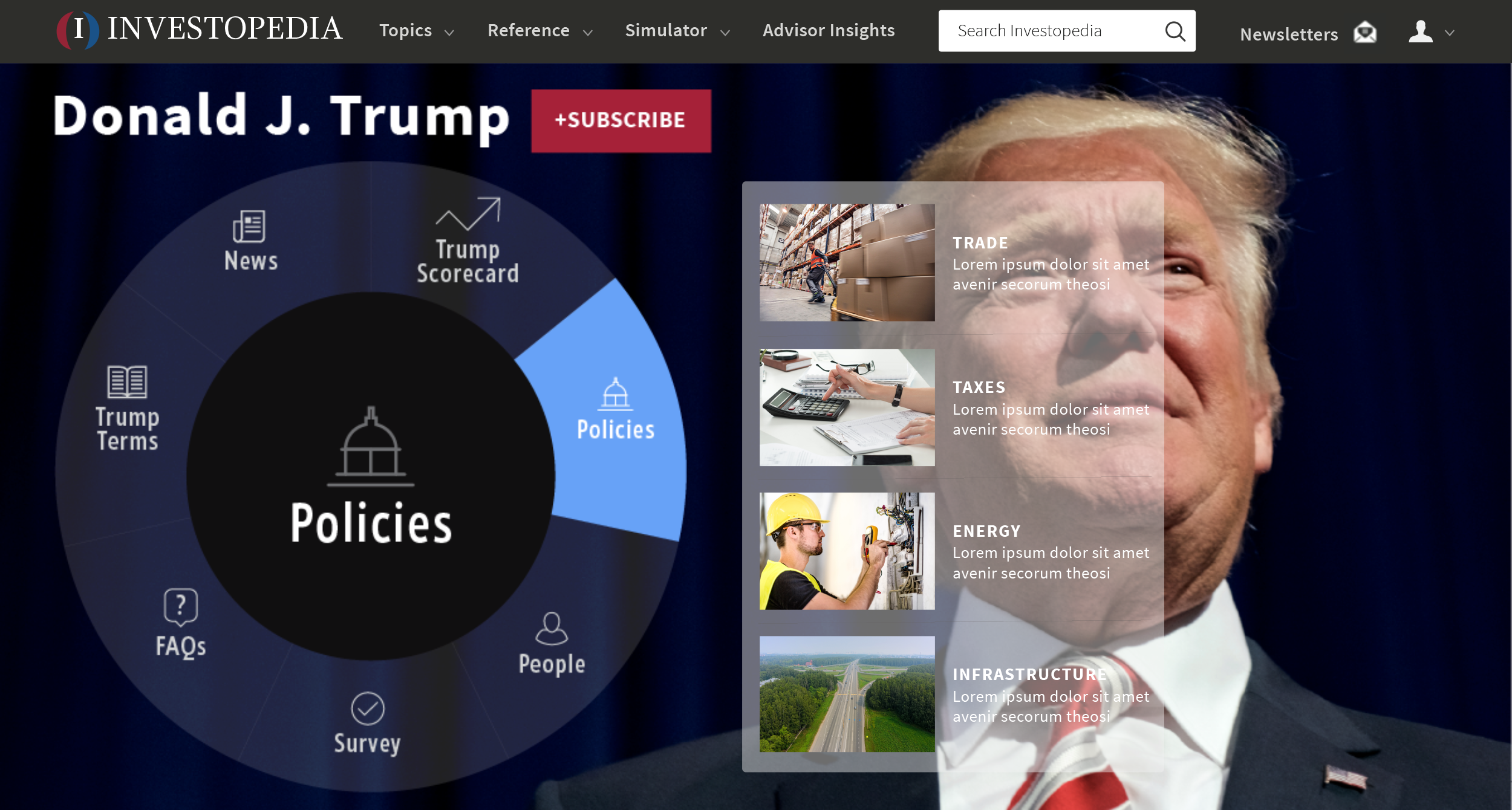
There were a number of issues with this initial version of the Radial UI. The two that immediately stand out are having text and images over the face of Trump. The other issue relates to the mouse position for the dynamic generation of content via a hover state. For example, if the user wanted to interact with "Trump Terms" she would hover over Policies. This was a major error. The design had to change.

Wireframe sketches of the Radial UI that attempted to solve the mouse hover position and the display of related content.
The solution to the mouse over interaction was to have the content appear within the wheel.
Ideation
Brainstorming sessions were held to think through the categories that were new for Investopedia such as the display of the Investopedia Anxiety Index along with the scorecard. The session on the scorecard was the most collaborative. The Investopedia Anxiety Index visual was left to UX to ideate without the aid of editorial due to the technical nature of the visual. Visual references were collected to inform UX.
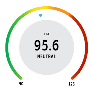
The design of the barometer for the IAI (Investopedia Anxiety Index) presented the opportunity to use a branded visual that would not only live on the Trump topic page but would also have its own page and be sponsored by an advertiser. It also later lived with the markets header on the home page.
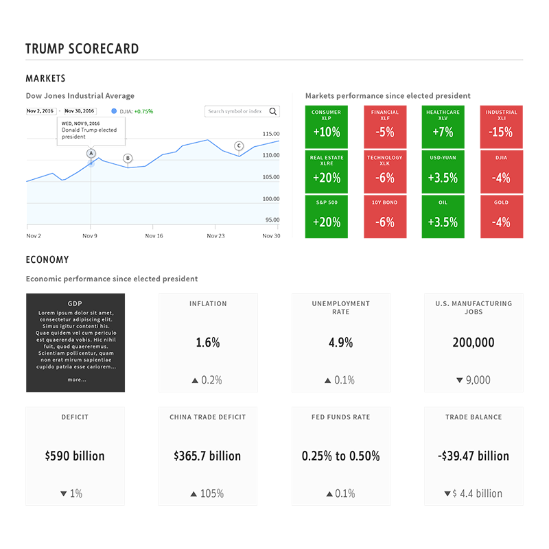
Trump Scorecard was the result of a collaborative effort between product, UX and editorial. The ideation led to wireframes which were mocked up for the final visual after approval.
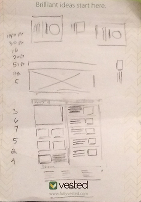
Early sketch for hero and news sections. This was later created as a wireframe for the first round of critique.
Revision
As stated above there were some initial assumptions about the radial UI that had to be revisited to prevent issues of user interaction. Other content areas such as the use of video content were also revisited and subsequently removed based on editorial feedback.
Final Product
After revisions, acceptance criteria was written for the final design by product management. UX assisted on making sure the interactions and the CSS were up to spec for desktop, tablet, and mobile. A promotional video was created supervised by product and UX. Other promotional items were created to boost the page throughout the website.
Reflection
The use of uncommon UI such as a radial UI should be properly considered by UX and product before use. Understanding all its interactions and edge cases. This would prevent issues of interaction for the end user and would create an understandable and agreed upon behavior for development. If there's confusion UX should seek out others to think through the interaction creating realistic scenarios of use. This is appropriate especially if there's no budget/time for user testing.