EVERYDAY HEALTH.
CIVIC INNOVATION PLATFORM.
Project Introduction
The whattoexpect.com web property for content and media company Everyday Health was faced with an SEO problem which included both usability and engagement issues for the brand's users who seek to have their questions answered during pregnancy.
In order to address these issues, a competitive analysis was done at the beginning of the project to understand the landscape of pregnancy websites competing to be ranked as the first result when a prospective and current user searched "week 12 pregnancy" for example.
Process
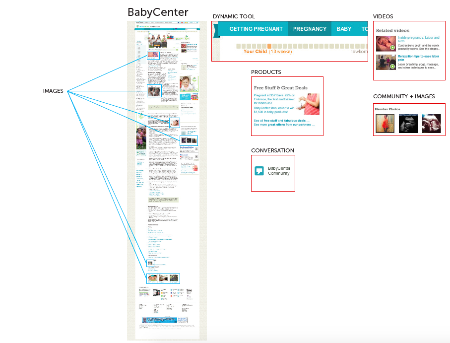
1. Competitor Websites were collected through Google search results for “Week 23 Pregnancy”.
2. The first two pages of results of sites served as the set of sites for evaluation.
3. Other websites that are content-heavy which use best practices for design were collected to showcase some principles to keep in mind if we want to create highly engaging “content destinations” for WTE landing pages.
Rationale
1. Competitor Websites give us an idea of what the status quo is and where our opportunities lie for differentiation through content and design.
2. Our hypothesis is to offer our users more value by offering content that leads to high user engagement thereby driving conversion.
3. Looking at sites outside of the subject of pregnancy allows us to broaden our approach.
Competitors
Sites that rank on 1st page in Google search
1. BabyCenter
2. What To Expect
3. Parents
4. the bump
5. American Pregnancy Association
7. Parenting
8. baby gaga
9. Pregnancy Corner
Competition
Where does WTE fall relative to competitors with respect to an engaging and informative experience?
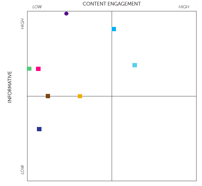
Content Engagement: Drives user engagement through images, video, shopping/products, conversation and niche (recipes, fitness plans, news, etc.) while being dynamic and engaging. Informative: Relevant and specific content with respect to the week of pregnancy.
Key for the competitive matrix above.
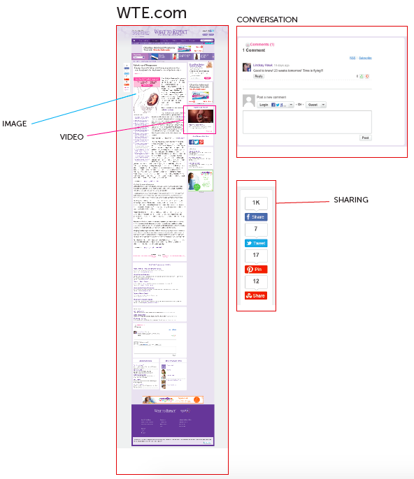
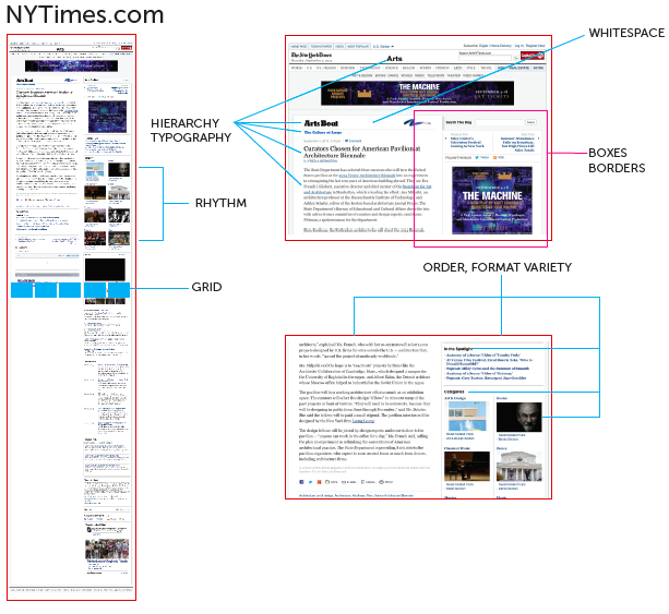
Content Engagement: Drives user engagement through images, video, shopping/products, conversation, and recency/frequency. Informative: Relevant and specific content with respect to the category. Design: Adheres to best practices for content-heavy page. This includes the use of a grid, typography, hierarchy, rhythm, minimalism, whitespace, containers (boxes, borders), format variety (blurbs, images, lists), consistency.
Product Objectives
New adaptive design to address user needs and product goals.
1. Data was used as the starting point to help determine what would make the most impact for our users and business.
2. A significant majority of traffic comes from mobile web. Mobile first approach.
3. Things we can measure and iteratively improve upon:
Registration & Sign Up
Return VIsits
Page Depth
Bounce Rate
Time Spent
Engagement
Ad performance
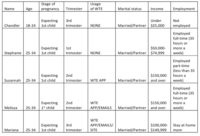
User Research
Usability Study participants grid for WTE landing page and competitor offerings.
User Needs
To be healthy, active, and energetic.
To have her questions answered.
To feel the support of friends and family.
To reduce stress and to feel calm.
To not feel scared.
User Goals
1. A need to balance content depth with easy to find additional topics and tools on the page.
2. Key offerings like week by week video need to be brought to the center rail.
3. ‘Want to know what’s coming next’ was a big need.
4. Featuring relevant community conversation can help with ‘am I the only one?’
5. A visual way to convey how their body and baby are progressing is important. More compelling visuals and video can help set us apart.
6. Add content around “Is this normal” to help alleviate common fears and generate excitement at each stage of pregnancy.
7. A series around Ask Your Doctor—for each pregnancy checkup we provide questions moms to be should be asking their doctors.
Design Studio
A Workshop was held with cross-functional teams in groups to iteratively generate divergent ideas to explore design problem mapped back to user needs and goals.
1. Sketching was timeboxed and participants pitched their ideas to their group and the group offered critical feedback.
2. Ideas were borrowed, sampled, and made better through conversations around a design problem.
3. Ideas began to converge throughout the various cross-functional teams.
4. The purpose of the exercise was to explore a large number of concepts and solutions quickly; to also get the stakeholders buy-in for later stages of design presentations.
A/B Testing Prototypes
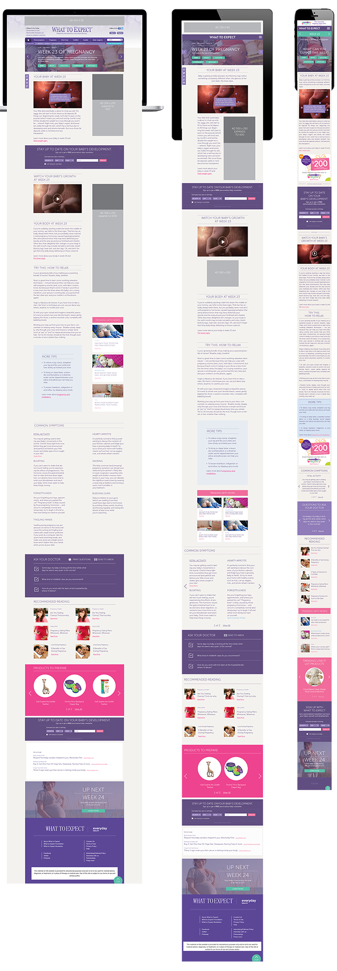
Two different design approaches were used as a means to test the outcome from the design studio exercise.
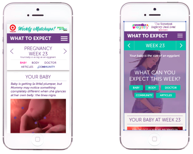
The image-heavy design which was a user favorite during usability testing came out on top during A/B testing. The design was then adapted for different devices. See below.